Myrsäter
Problem
The Myrsäter family has been manufacturing interior for major brands since 1980. As they now take the leap to design and sell as their own brand, we were asked to update their identity. The challenge was to reflect the long and extensive experience of craftsmanship while also communicating a fresh start and a brand new design language.
Insight
The family’s history in racing caught our interest. Especially since a big part of their design language is based on principles from the world of motors. This source of inspiration creates a unique vantage point for their products, which might also be transferable to brand assets to create a distinctive identity.
Solution
Our solution is a dynamic identity where streamlined elements from the world of motors clashes with geometric minimalism.
And we are just getting started. Stay tuned for a more elaborate case study with another brand asset or two, coming later in 2022.

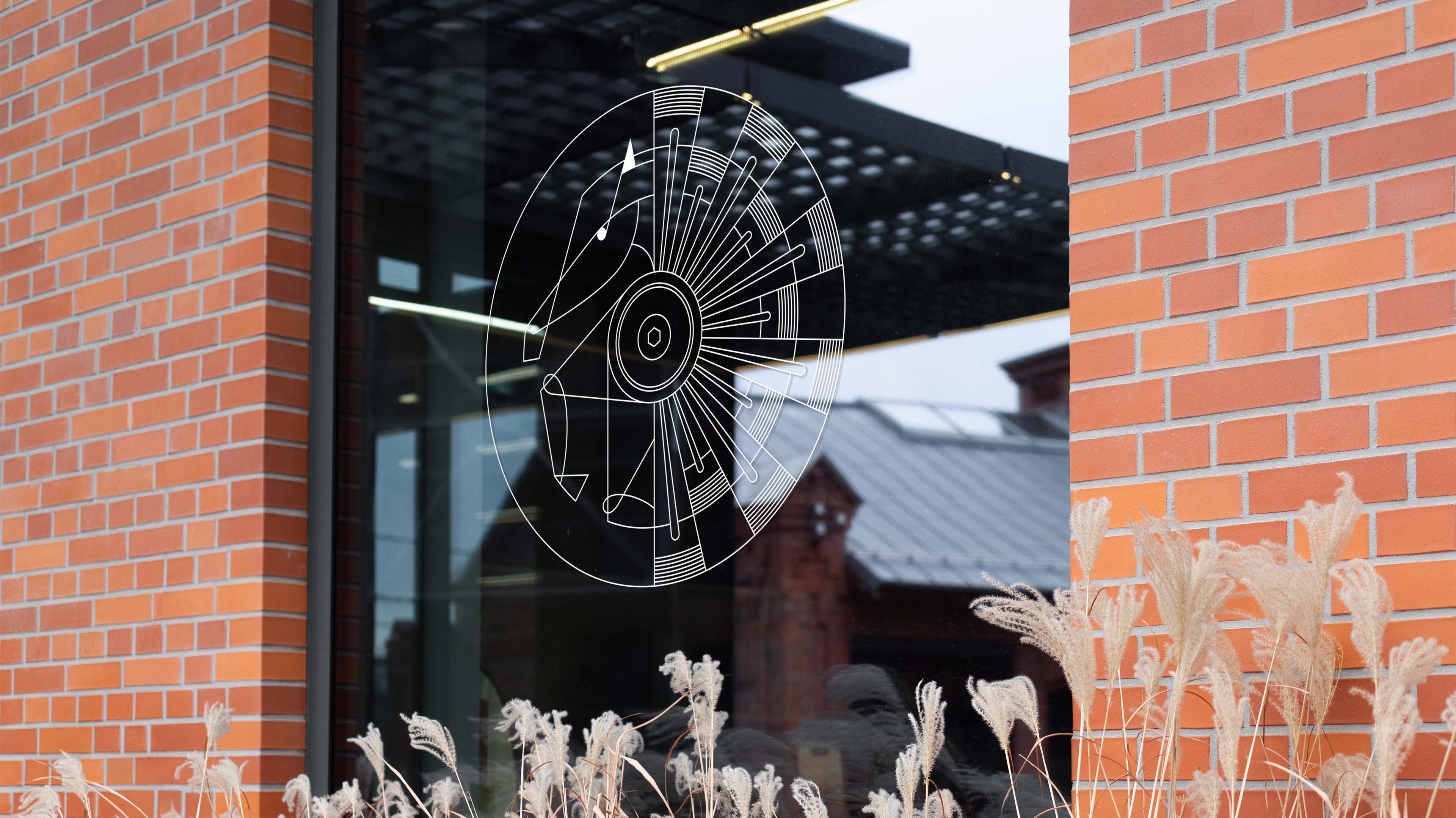
A new family crestThe name Myrsäter originally derives from the name of a horse farm. The silhouette of a prancing horse fused with the cross-section of an engine forms a unique family crest. We made it scalable by drawing it in a detailed grid, making sure it always leaves a great impression.
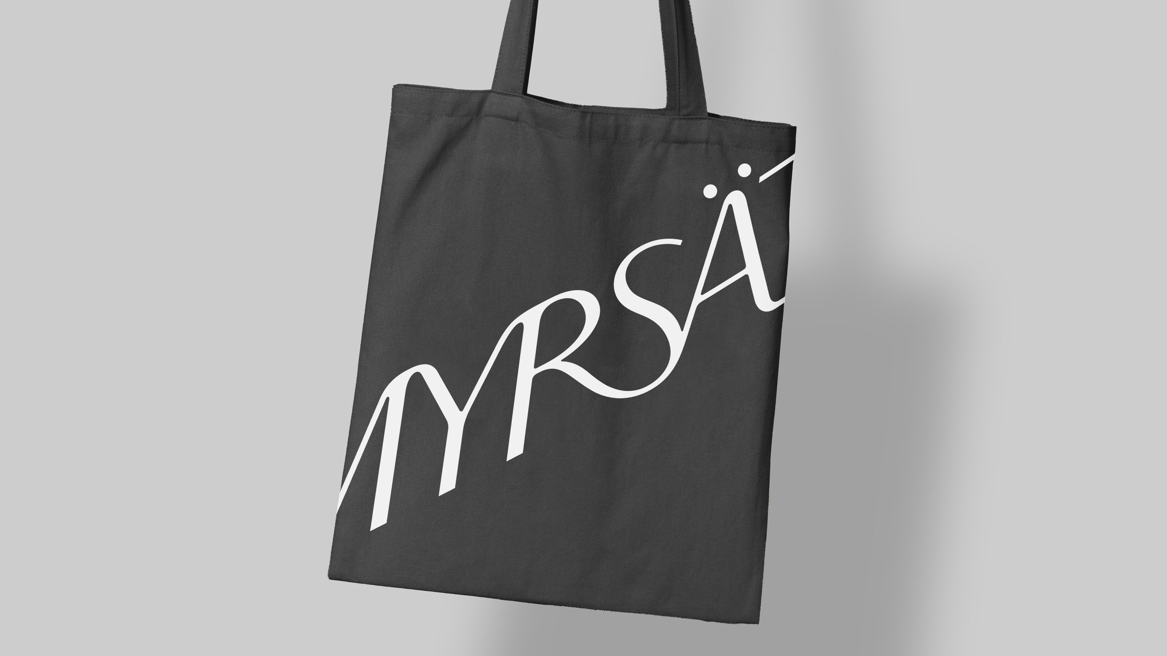
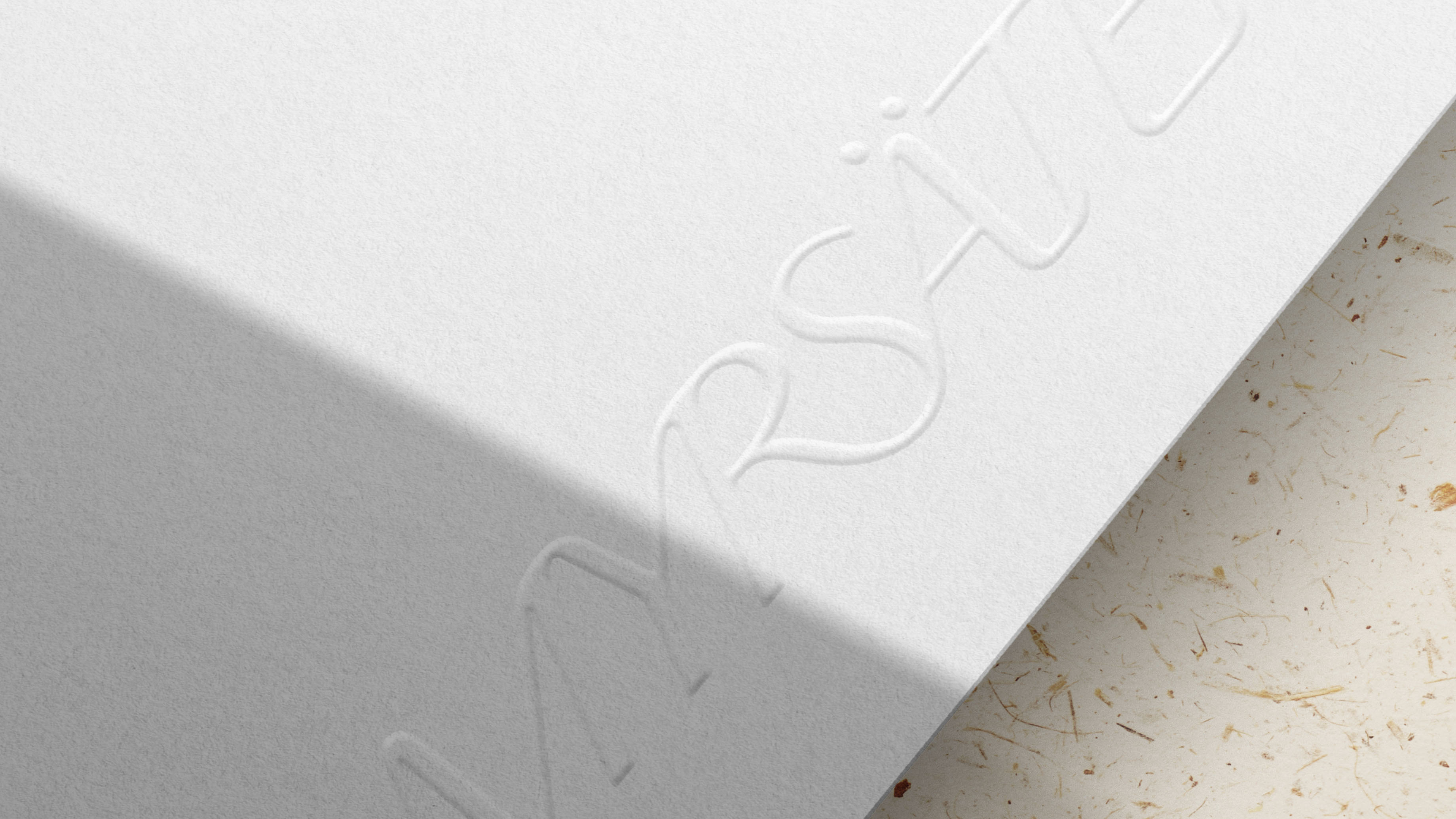
A custom wordmarkWith inspiration from the streamlined design seen in the in the world of motors, we created a custom wordmark to accompany the family crest. The dynamic expression and the slightly forced ligatures take us back to classic chrome logos of Thunderbirds and Zodiacs.


A responsive iconFrom a distance, each piece of furniture forms an appealing silhouette, but when you get up close you can really start to appreciate the craftsmanship in every detail. The family crest works in a similar way, with four different versions and a progressively increasing level of detail.